
In comics, page structure IS story structure.
PAGE IN PROGRESS
Suggest edits & topics >>
AS SEEN IN: The Handbook!
Page Layout = How we arrange panels & other elements in groups & pages…
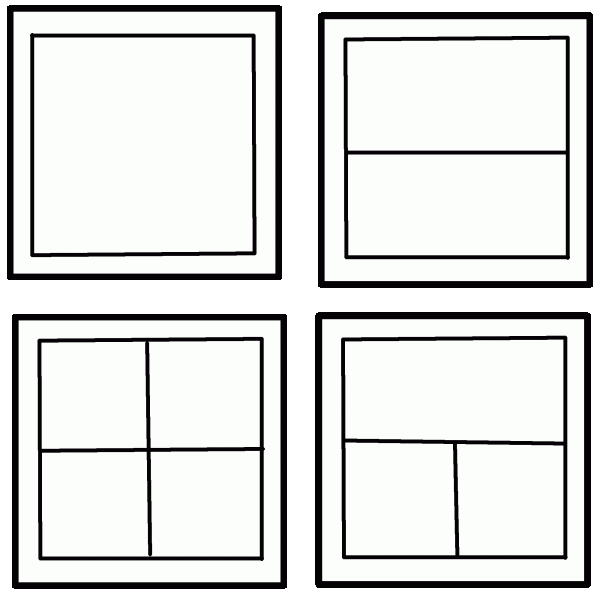
RULE#1: Keep It Super-Simple!
Start with the simplest possible page layouts — You can build the most powerful, challenging projects out of the most basic building blocks.
Start with 1-4 panels per page. Draw & write a little larger than you think is necessary.

Test your pages out on readers. Ask them to read your pages aloud, as you listen carefully.
Notice where they read clearly…
= They’re caught up in the story!
Notice where they stumble or falter…
= They’re distracted by the reading!
Experiment with layouts “borrowed” from your favorite artists.


TRY THESE PAGE LAYOUTS:
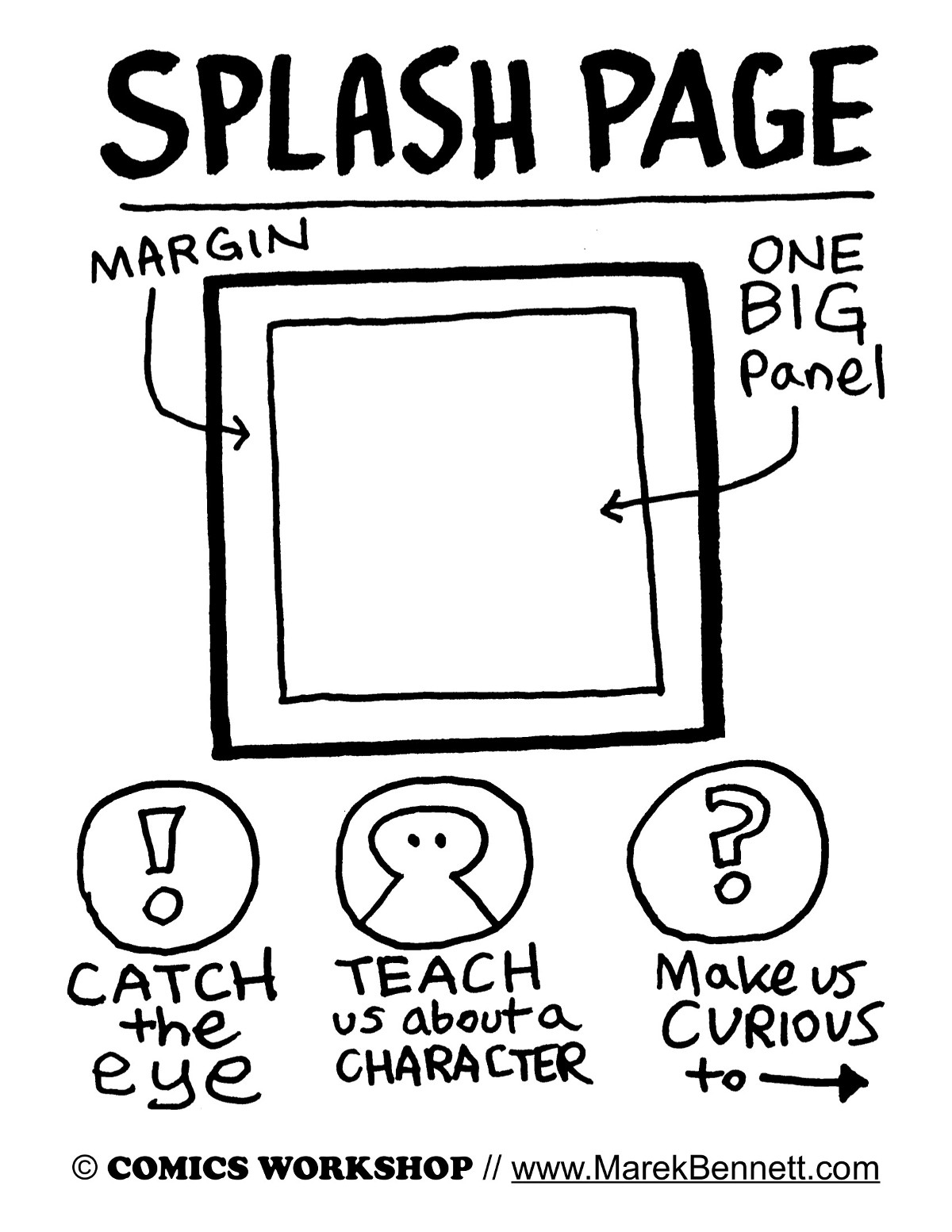
Splash Page TEMPLATE
This single panel page delivers immersive impact! 📖💦😲
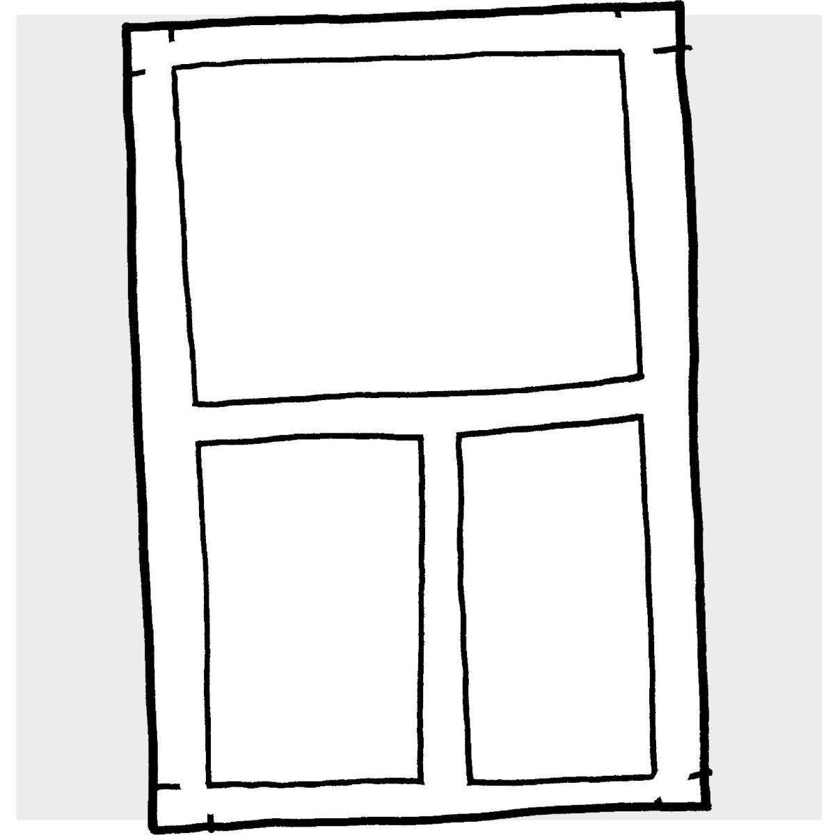
3-Panel Page TEMPLATE
This simple 3-panel page is one of my favorite ways to jump-start a longer story…

3-Panel Comic Strip TEMPLATE (+ Research Notes)
Here’s a blank 3-panel comics layout I use in various activities & group anthology projects…

4-Panel Comics Template
A super-simple worksheet for quick comics creation!
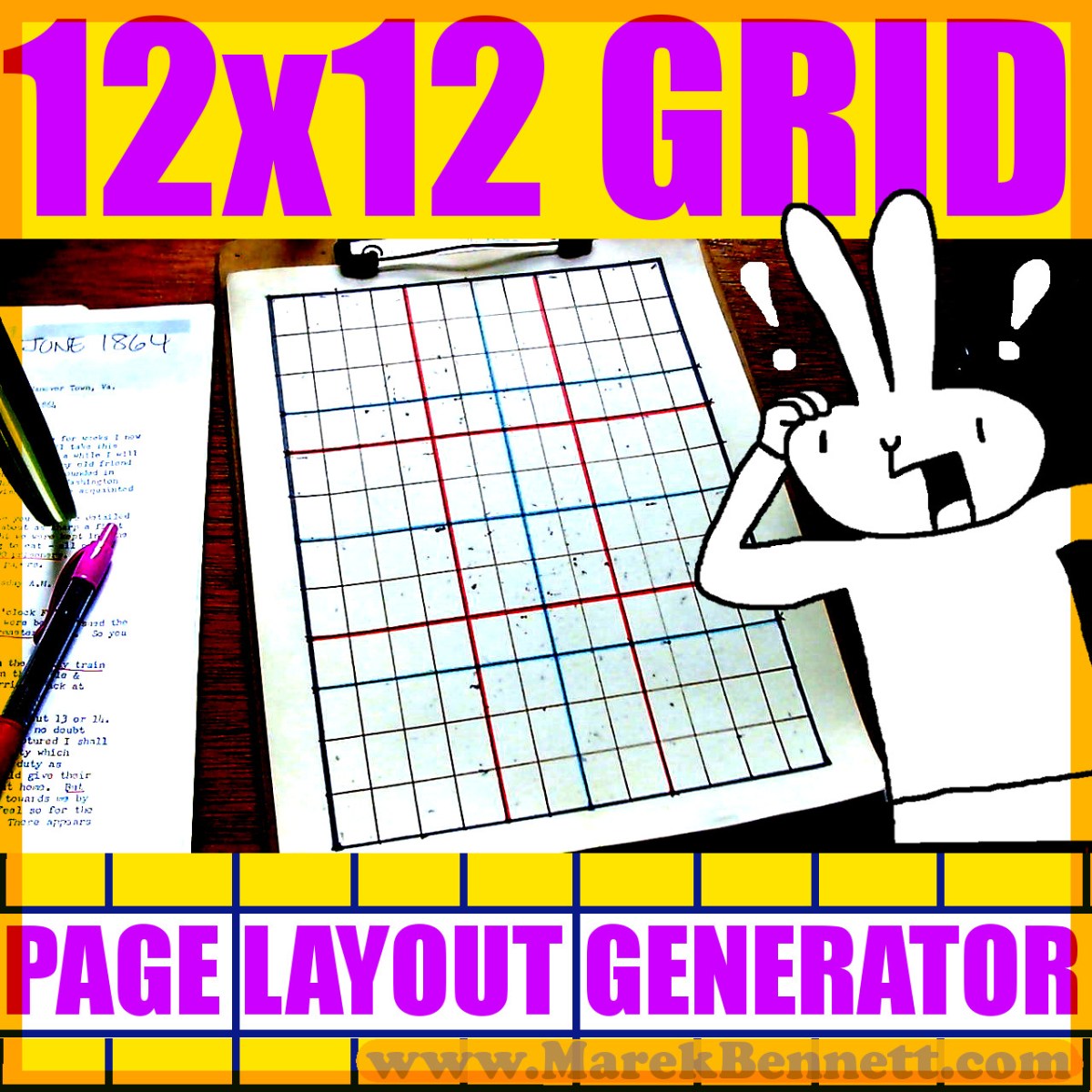
12×12 Layout Grid
= The top-secret guide I use to design EVERY PAGE of my graphic novels!
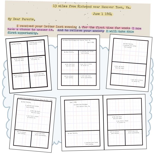
Planning a New Page: Primary Sources on the Grid
How the 12×12 GRID frees us up to focus on creative storytelling…
