
Here’s a secret LAYOUT GRID I use to make every page of my Freeman Colby graphic novel series.


INTO THE BLANK PAGE:
Facing a BLANK PAGE can be tough — How should we use all that open space? How will our panels fit together? Where do we start drawing?

To help make basic panel placement decisions, I’ll use a layout GRID.
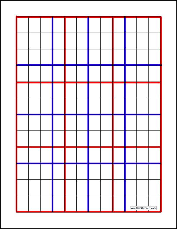
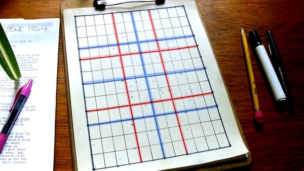
First, I set up a full-page 12×12 table (w/ a basic word processor program) & printed it out on some sturdy paper:

12 is a great number because it divides by 2, 3, and 4. Below, I’ve highlighted these basic fractions in different colors: (RED = thirds) (BLUE = fourths):
Tracing along these grid lines frees me from technical choices (measuring & placing panel borders) — Instead, I can focus on the storytelling inside (& among) those panels.

REGULAR LAYOUTS:
The simplest panel structures here are the full-width layouts: 1×2, 1×3, & 1×4:
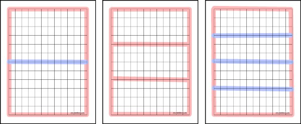
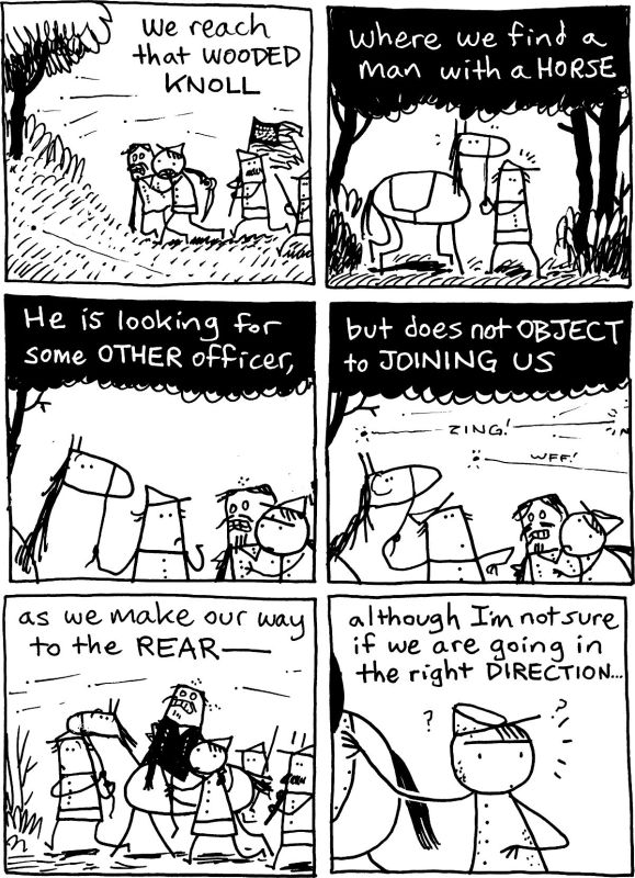
I use this “1x” approach in many Vol. 3 pages — I find it reads cleanly & smoothly, both on the printed page & onscreen:

Of course, we can also trace regular grids of 6-12 panels:


Regular columns & rows give a certain rhythm to each page. They help readers (& characters) move creatively through the space!
Even when the panel sizes vary, the underlying grid maintains that sense of rhythm & grouping…
The regular panel sizes also help us read pauses & actions across time:
SAMPLE PAGES:
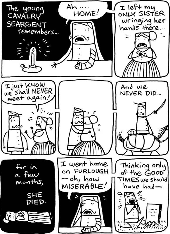
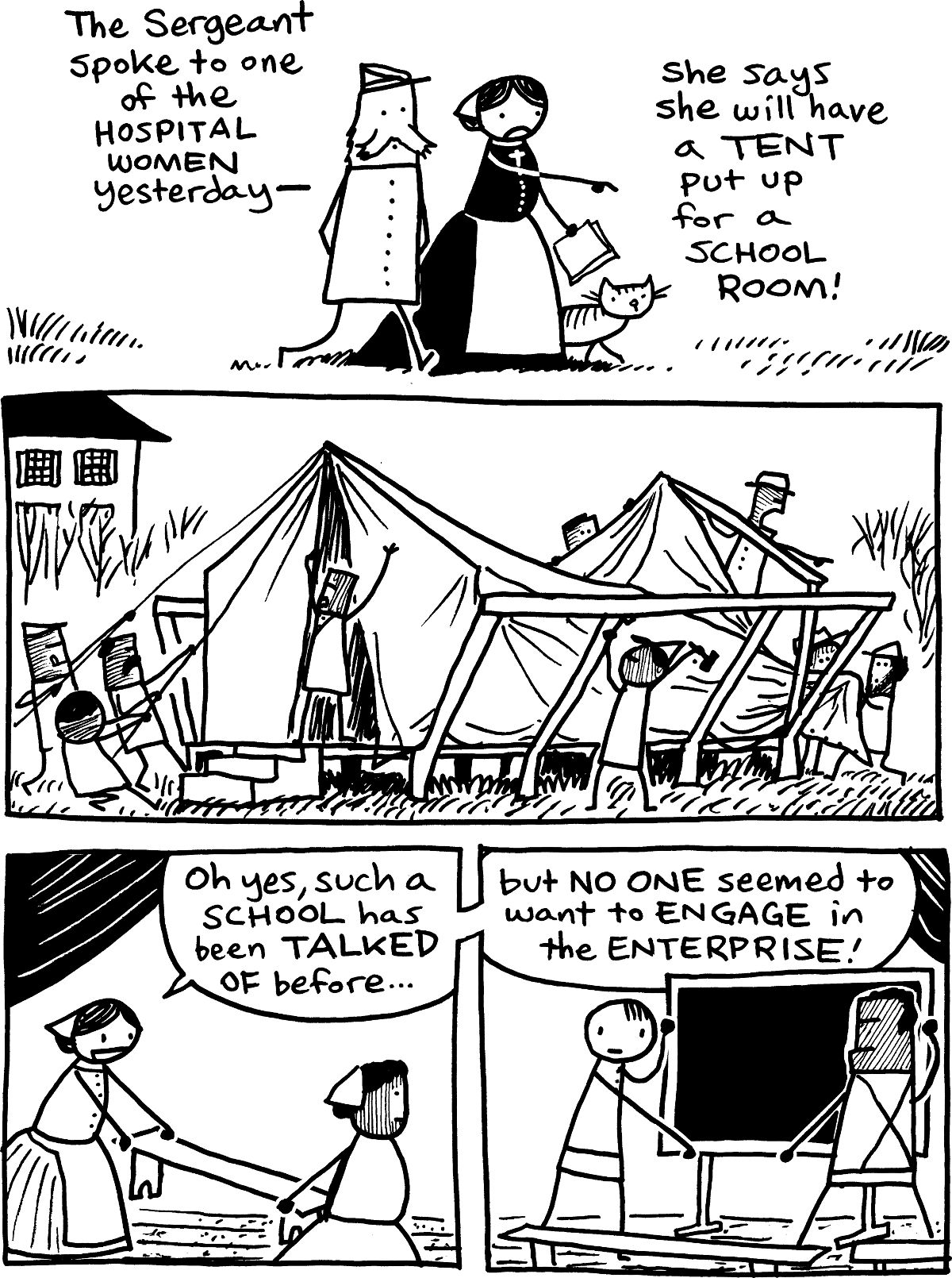
Each of these sample pages from Freeman Colby Vol. 3 uses the underlying 12×12 grid a little differently… :


Of course, the 12×12 grid offers MANY more layouts & combinations of fractions… Stay ‘tooned for more demos!
FOR PATRONS:
Printable 12×12 GRID >>
