Simple steps to help your comics reach more readers…
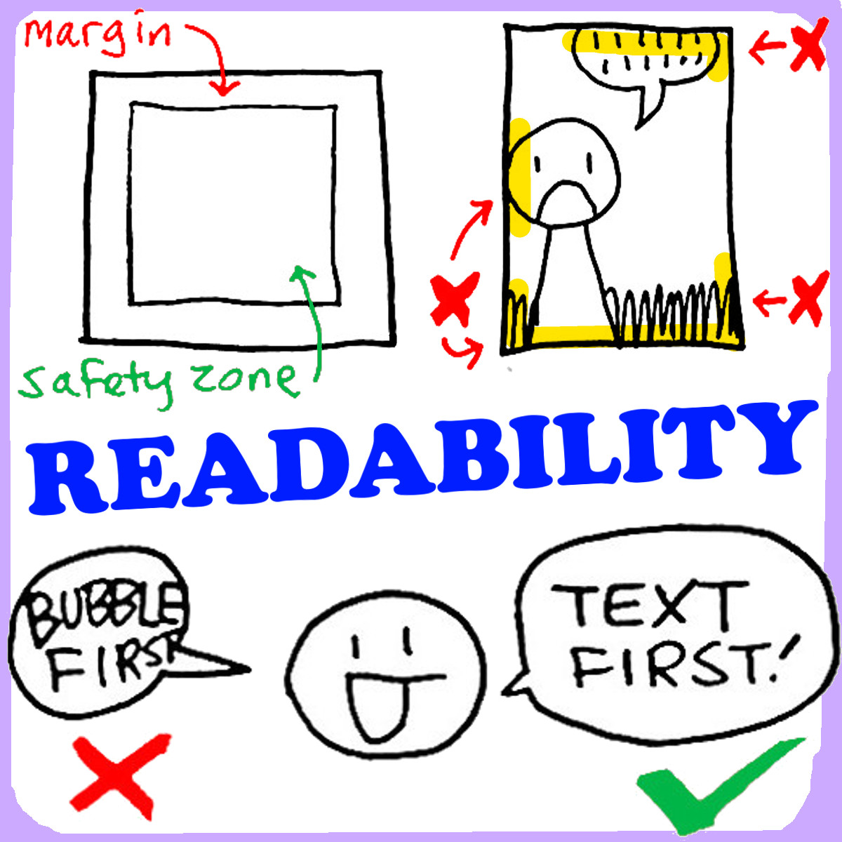
Margins
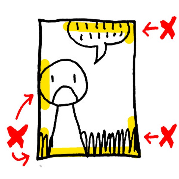
Pencil a margin or “frame” around the outside edge of each page. Ideal size:
- FULL PAGE: 1 or 2 finger widths from each edge of the page. If using a ruler, up to one ruler’s width (~1″) from edge of page.
- 1-SHEET MINI PAGE: The width of a pencil from each edge of the page.
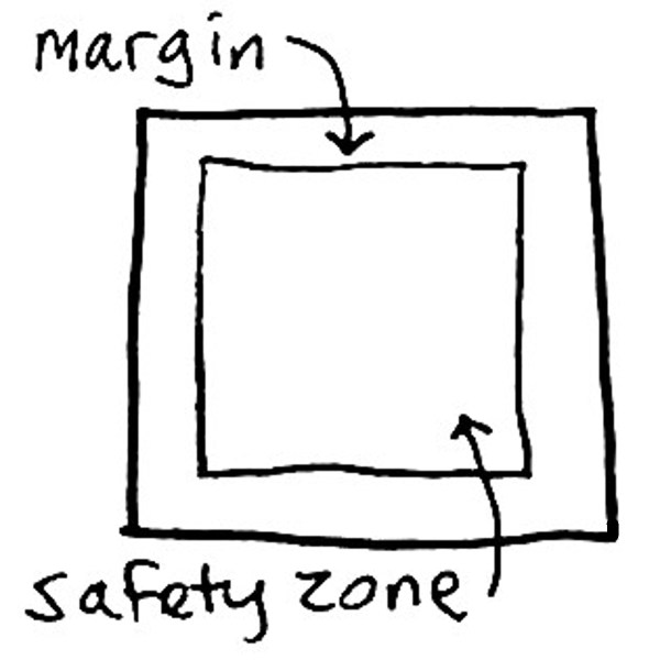
All the important parts of our artwork (characters, actions, text, etc.) must fit INSIDE the “safety zone.”
USE MARGINS to protect your artwork from getting clipped at the edge of the page.
WITHOUT MARGINS, important text & details may get clipped during printing, and disappear from the final product!
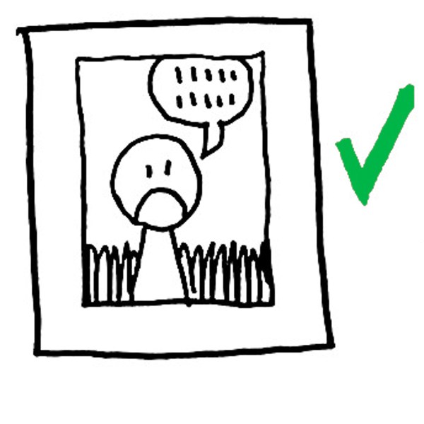
Use that space!
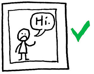
Be sure to use your entire page space to maximum effect.
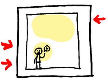
Packing characters & text into the corners leaves much of the page space standing empty…
Bringing our characters up & out, into the page, and making sure all text is clear (= SIZE + SPACE) helps our readers see & enjoy the story…
(And yes, a little open space here & there DOES help make things more readable.)


TEXT FIRST.
This one’s super simple…

ABOVE LEFT = I drew the BUBBLE FIRST, & then tried to fit the text into it. This almost never results in readable text! Letters get scrunched, or cross over lines & lose their shapes…
ABOVE RIGHT = I wrote out my TEXT FIRST, & THEN drew my word bubble around it. That way, the bubble fits perfectly around the words.
The Six-Foot Read
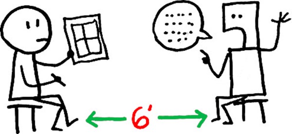
Hold your page 6-10 feet away from a test-reader. (This replicates reduction by 50% on a scanner/copy machine.)
Can they still read everything clearly?
IF SO: You’re probably drawing large enough.
IF NOT: You may want to enlarge text & other key details…
More about P*I.E. Process & conferences >>
